New Era, New Look?

Since its unveiling in the Summer of 2008, the Oklahoma City Thunder logo and branding have remained largely the same. There have been a few slight tweaks to the Chesapeake Energy Arena court and traditional jerseys, (Icon and Association), but other than that, they have remained largely the same. The “Shield”, as Thunder personnel call it, has been emblazoned on pretty much everything OKC (except for alternate jerseys and gear) for 12 years. The “Shield” has represented a truly spectacular era in Oklahoma City history, which has had both enchanting highs, (two MVPs, the 2012 Finals berth, sustained playoff success) and some crushing lows (injuries, trades, and that one free agent departure). It has truly been an incredible run, but like many things in life, there comes time for a change.
The summer 2019 trades of Paul George and Russell Westbrook effectively ended the First Era of Thunder basketball, and started the Second. With a largely revamped roster (filled with newcomers), spearheaded by Franchise Heir Apparent Shai Gilgeous-Alexander, now is absolutely the perfect time to rebrand.
New Era, New Look
A rebrand would help tie a new logo to this Second Era, just as the “Shield” represented the First Era.
When the Thunder started making alternate jerseys, fans were excited as they were something new. The alternates were often much more expressive of personality, city heritage, and sharp looking. While not all of them have been hits–the vertical navy, short sleeved whites, and gray 2018 jerseys come to mind–most of them have been wildly popular. In fact, demand and excitement for these alternates has been so fierce, it raises the question of “Why not make these jerseys permanent?”
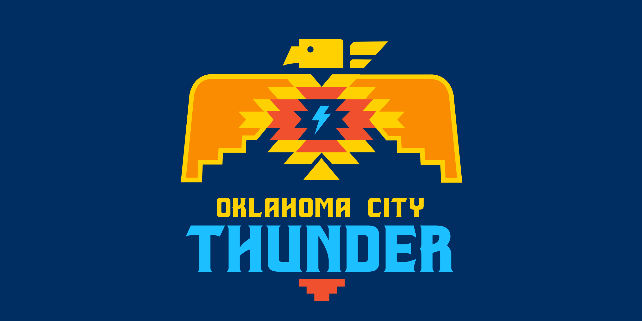
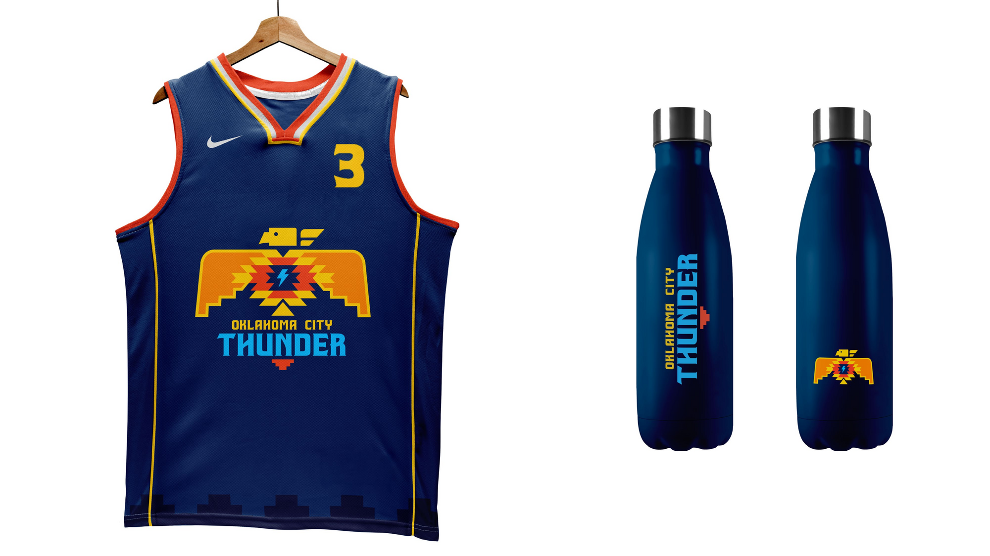
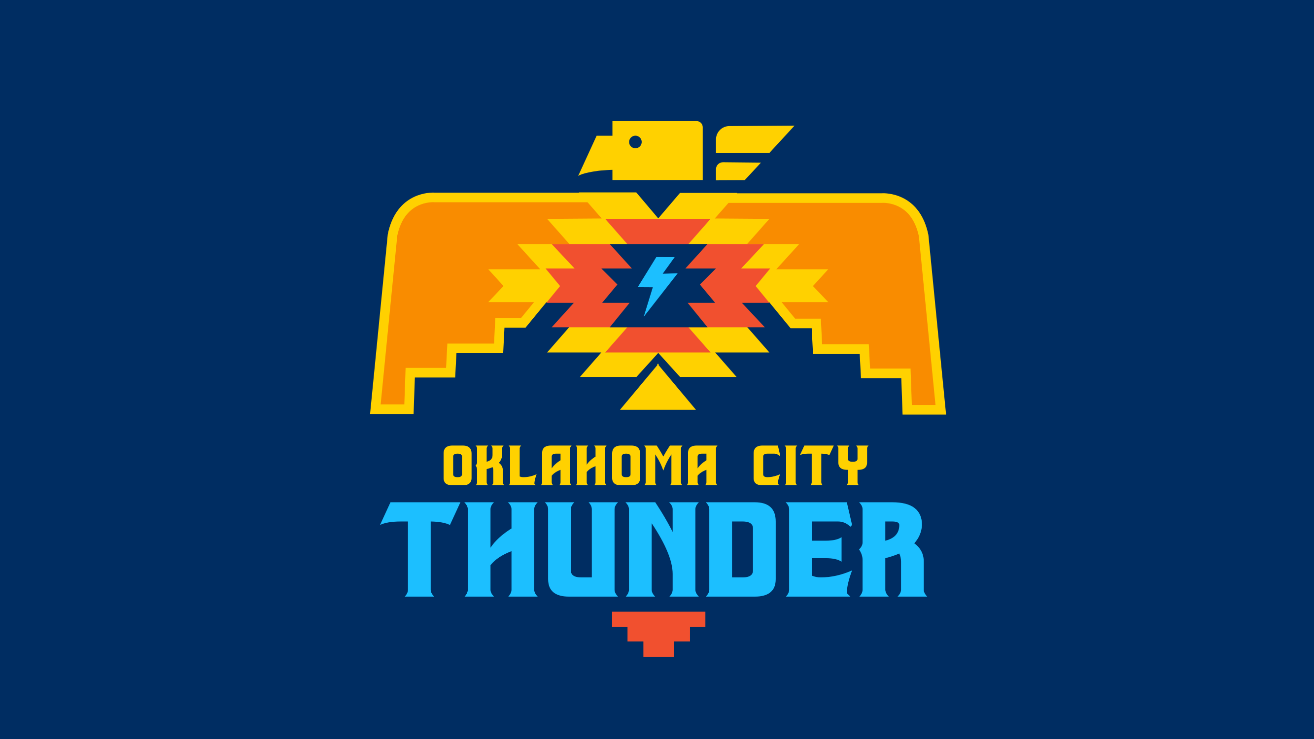
In a recent Erik Horne poll on the Athletic, the vast majority of the fan favorite jerseys were alternates, with the 2018-2019 turquoise, Native American heritage-inspired City Jersey taking top crown by a significant margin. Daily Thunder’s graphic designer Natasha Panchal created this “Thunderbird” concept as a nod to the same heritage as those uniforms:


The various alternate jerseys offer an array of bold color schemes and design choices; it’s clear that the fanbase is particularly fond of them. Having a rebrand centered around any of these–those 2018-2019 City Jerseys, the navy (2017-2019 Statement) or orange (2019-2020 Statement) jerseys and logos, or the 2019-2020 grey City Jersey (in honor of the OKC Bombing Memorial)–would seem to be a well received plan. There are some striking drafts of these in the community, pictured here courtesy of OKC Tracker:
If, for some reason, OKC is adamant about keeping the traditional branding, then the team could at least wear alternates more often and have alternative courts for when they play in them like the Utah Jazz and Sacramento Kings use.
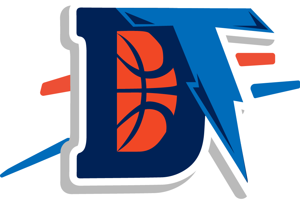
If the Thunder were, in fact, interested in doing a full scale rebrand (logo, color schemes, etc.), they could definitely look to the fan community for inspiration. There are many wonderful designs made by talented individuals within the OKC fanbase, some making only subtle tweaks to the branding, and others bringing about a full-blown revamp. In fact, the original field of team names voted on by Thunder fans included the “Bison”, which has inspired many fan concepts since. A consultant for the original logo also told Zach Lowe that plenty of bison artwork was left on the scrap heap.
A bison logo would certainly represent the state’s heritage and tie in with the original inspiration for the team’s namesake. Oklahoma City already has Rumble the Bison, who is quite the popular mascot, so why not just fully embrace the bison imagery? Or, if they wanted to go the “lightning” route, there are many wonderful fan designs utilizing that type of imagery, as well.
Whatever the design focus, NOW is the time to rebrand and represent OKC as it charts a new course in this era. Thunder Up and Thunder forward!
Thank you to the creatives in Thunderland who designed and granted Daily Thunder permission to publish their jersey/logo concepts.
