
Tuesday Thunderbolts: Uni reaction
- Ball Don’t Lie says the new unis look like someone we’ve seen before… where have we heard that? “These could have been a lot worse, especially after the tragedy that is the team’s logo, but we can’t help but shake a sneaking suspicion that we’ve seen these new Oklahoma City Thunder uniforms before. Like, on Patrick Ewing.” One comment left said simply, “Bennett keeps stealing.” I don’t care who you are, that’s funny. And if you’re super-sensitive to anything negative about the team, be sure to steer clear of the comments.
- Uni Watch: “These things are so generic, they might as well just have “Basketball Team” printed on the front and then they could have a cameo scene in Repo Man. It’s not like they’re ugly, mind you. Au contraire, the colors are reasonably pleasing, the road jersey typography would look pretty cool on a 1960s NCAA team, and the whole package is admirably gewgaw-free. But for an NBA team rebranding itself? It’s tempting to call it a joke, except jokes are funny. This is just sad.”
- Newsok.com’s “OKC N’ Style” breaks down the new threads. (And here’s her written story too.) This has to be one of the worst/most awkward things ever done, ever. The lady has absolutely no knowledge of NBA uniforms (and she even admits that, so why is she discussing this?) and even says at one point how much of “an attention getter” white is and how good of a choice it was. As if the team chose white. For those scoring at home, white is pretty much every home team’s uni color – except in rare cases like the Lakers. Leave it up to Newsok to take something as anti-gay as professional sports and turn it into something that feels a little gay by breaking down color schemes and what kind of emotions sky blue puts off. I’m trying not to really comment on these media hits, but I couldn’t help it with this. Come on lady.
- Via Realgm.com’s message boards: “Personally, I think they look really good. Not being sarcastic at all,” and “Their white jerseys aren’t as bad as I thought at first, not bad at all really though resembling some other teams. The road though, I’ll admit the colors are ok but wow, that’s way too much text for a jersey.” Within the four pages, the consensus was pretty much divided evenly between “gross,” “good” and “they’re alright.” And seems like everyone’s got a comparison – there were comparisons to the Warriors, the Knicks, the Bobcats, the Nuggets, the T-Wolves and even the Hornets in there. So does that mean pretty much every NBA team looks like every other NBA team? Doesn’t seem like OKC is the only culprit there if everyone else looks like each other too.
- Chris Littmann of Sportingnews.com: “Honestly, these uniforms remind me of the Memphis Grizzlies’ duds. Pretty plain, similar colors and no huge logo or anything on the front.” If I hear someone compare the jerseys to the Celtics’, then I’m cashing it in.
- Zorgon from Blue Blitz: “Third of all, the fronts of both uniforms are just a little bit too bland and noisy. The white uniforms have orange tracing around them for some god-knows-why reason. Combining it with the white and yellow doesn’t turn out too well in my opinion. The road uniforms also suffer from problems, as it just looks like they slapped Oklahoma, City, and the numbers on there with absolutely no regard for style. In conclusion, after a second look, these uniforms are pretty poor. They have some positive points on the colouring, but the uniforms are eternally marred by their use of butt crack logo and their overall genericness.”
- Bend It Like Bennett: “Now on to the road unis. I think the offical name for the color is “Expansion Team Blue”. She kinda lost me for a minute there because I’m no color expert myself, and the discussion becomes very dense and theoretical, but I’ll try to break it down. Blue is ‘dependable’ like the sky, because the sky won’t fall, even though sometimes times get tough, and also it’s very loyal. That’s so weird because whenever I think about this franchise, “stability” and “loyalty” are the two words I think of. But also blue is “powerful” like a bright blue Oklahoma sky with fluffy white nimbus clouds where some of them look like animals, and so you’re feeling all loyal and stable and then suddenly you see the red-orange trim and you’re energized.”
- One quick note from me, via The Thunderworld: I know I’ve already expressed how I feel, but I just want to say it again. I semi-like the new uniforms. They are streamlined and an attempt at being classy. If you want, start busting out every other team’s jersey and take a peak. The Thunder is right along with everyone. There’s no overbearing font, no overzealous picture – just who they are and what they are. Simple and sleek. Now, like I said also, I’m mainly giving them the benefit of the doubt because of what they were working with. I wasn’t a fan of the name, the logo or the colors, so that would make it tough to be a fan of the jerseys. But as for being too generic and too simple, I just don’t agree there. That’s what the world’s best uniforms are. The nickname Thunder was a little controversial so I’m very glad the team didn’t run with it and start putting storm clouds and lightning bolts everywhere. The team is named Thunder but this is really about Oklahoma City. That’s where the focus should be and I think that’s where it is. Right now, OKC is on top of every sports’ fan’s hit-list. We’re the punchline to every joke. It’s gotten the point where anything the Thunder does, sucks. Whether it actually sucks or not, everyone automatically thinks it will. They could go 60-22 and win the West and everyone would still think the team sucks. Just the way it is right now. But it will pass.
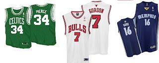
For those calling it too generic, are these too generic?

I don’t mean the uniform crusader here because I’m not really a fan either, but I just wonder if OKC is getting a fair shake. Did I just compare the unis to the Celtics? Well, I guess I’m done here.
Also, judging by this picture, the trim is most definitely dark blue. Glad to have that cleared up.